I admit that the USBP series looks kinda… bland. It’s text and line drawings; not a whole lot can be done to jazz that up. Especially since I have no head for graphics design whatsoever apart from layout diagrams.
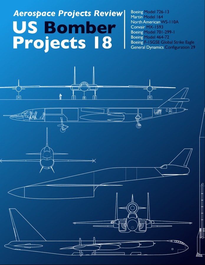
Still, one reader sent me a mockup of a revised cover of USBP #18:
Things are moved around a little bit, but the obvious change is the addition of color. The suggestion was also made to consider color-coding each title in the USXP series. Just off the top of my head, I came up with:
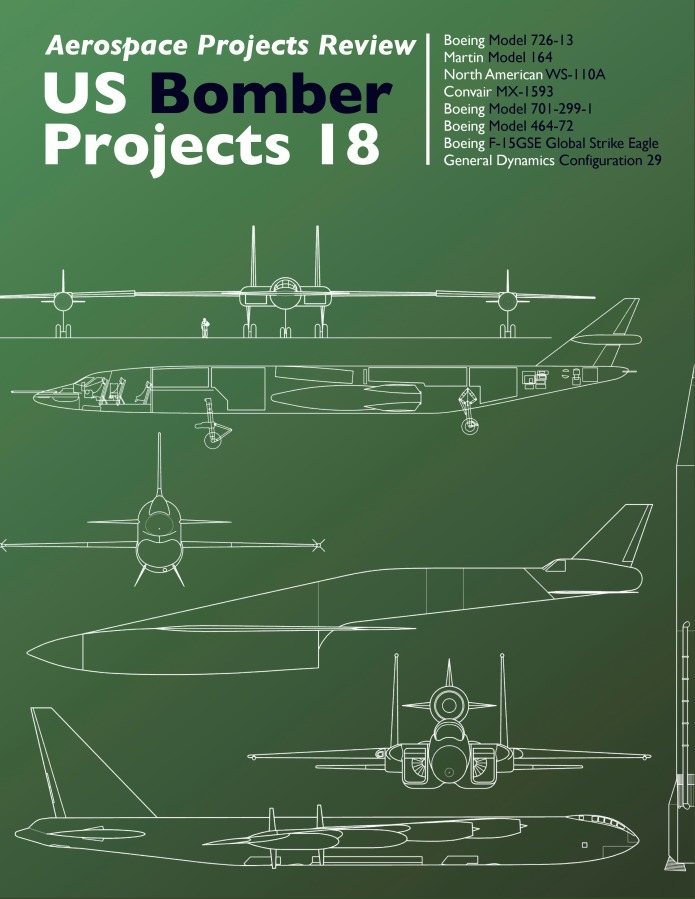
Bombers: Olive Drab
Spacecraft: Black
Launch Vehicles: Blue on bottom, transitioning to black at the top
Fighters: slightly bluish gray (like the F-15 or F-22)
Transports: ??
VTOL: ??
The USBP#18 cover was re-done to reflect this, thusly:
Thoughts? Is this more appealing?How about color-coding… good idea or not? And if so, what colors?
I tried something vaguely like this once before, with USBP#05.

