As a followup to this post, I’ve done some further experimenting with images.
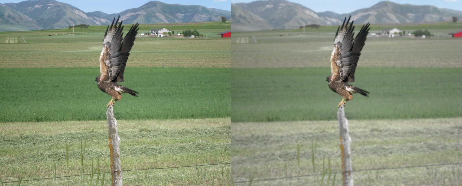
First up: a further refinement of the “hawk” shot. Shown here is the original on the left, and the modified version on the right. Rather than black and white, the background has been blurred, and the hue saturation turned down, but the hawk itself is left clear and bright. To me this seems to give it a “3-D” effect.
Next, I modified the Lake Marie shot. The upper image is brightened somewhat from the original; the lower image is a sepia-toned version of the B&W version.
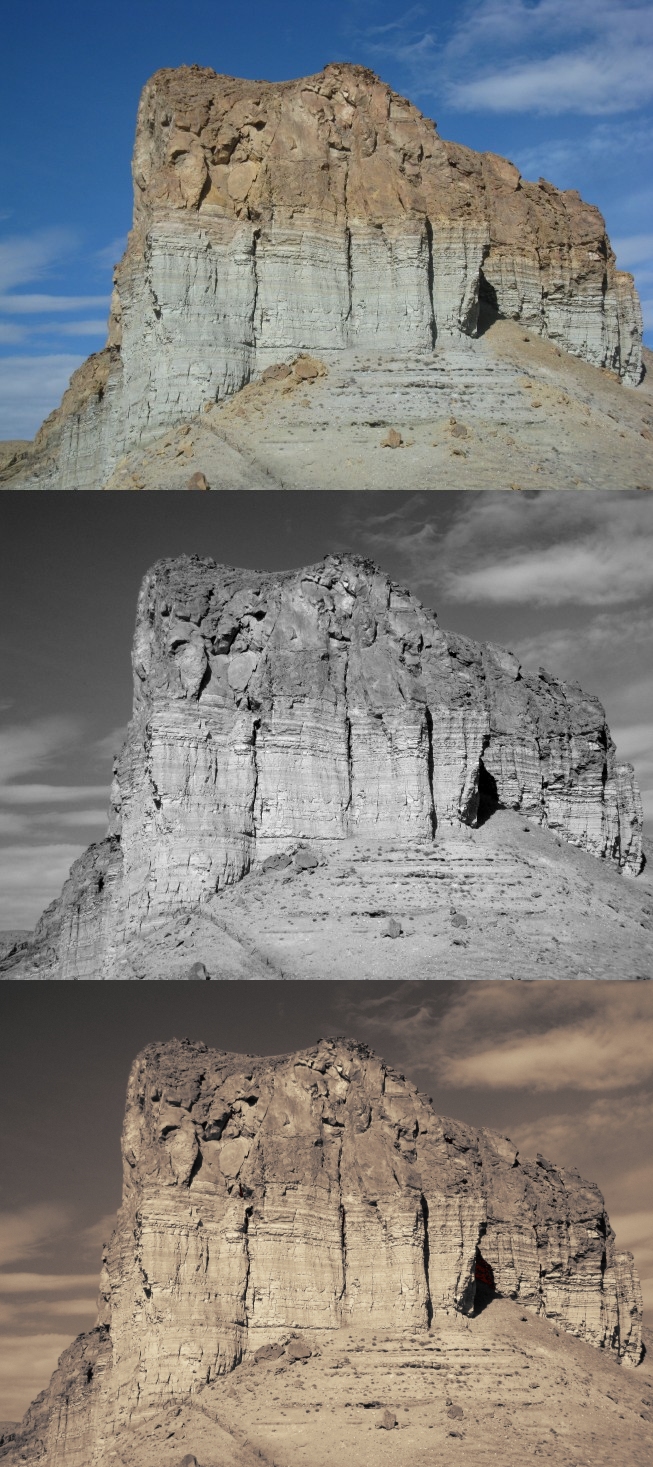
And this is a similar treatment of the “mesa” shot. Same color and B&W versions above, but at the bottom is a sepia-toned version of the B&W. Here, it looks good:
.
On screen, these images look pretty good. But yesterday I had the Lake Marie and Mesa images printed off (at considerable expense, I might add) in color, B&W and sepia: while there was general consensus that the sepia was somewhat better than the color for Lake Maria, there was no question for the Mesa: the sepia version looks freakin’ AWESOME.
One Response to “More photo tinkering”
Sorry, the comment form is closed at this time.


That last one does look pretty good in sepia.
Regards,
Barry