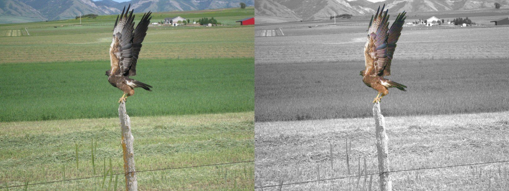
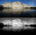
It appears that I am reasonably talented at taking the occasional decent photo. However, good though many of them may be, they tend to be kinda “vanilla.” Odd camera angles, catching unusal things in frame, visually attractive details in frame are good ways to make ’em more interesting. But right now in Utah it’s a time of “blah” in the landscape… all the plants are dead, brown and chopped down; but there’s not yet snowfall to make good winter scenes. So a good friend suggested that I tinker a bit with some of my existing photos. Two options were presented:
1) Black-and-white versions of the scenic views
2) Black-and-white with specific areas of color to draw the eye.
I have done this with a few test shots. While I admit to having the ability to make some good art, I also admit the inability to really tell what’s good art and what’s pretty but just kinda boring. So I’d appreciate feedback. Do these altered views turn what might be nice online snapshots into something that someone would want to spend money on and hang on their wall? The top-and-bottom comparisons have the B&W modified versions; the side-by-side comparisons have areas of color.
.
.
All honest comments appreciated.
3 Responses to “Modified photos… art or not?”
Sorry, the comment form is closed at this time.


I like the black and white ones, you can do things with them that you cant do with color. The partial colorized ones can look nice, but I don;t usually like them. However, a friend did one of LC34 where he put the abandoned launch stand in color and all the people around it in black and white which really set off the scene. So it does have its place
Hi Scott,
the dragonfly works the best of the BW + Color combos.
I think you could even intensify the colors.
The hawk looks superimposed, perhaps boost the contrast of the background image or have the hawk grade from BW at the fencepost to full color on the wings?
Mesa – up the contrast
Lake – reduce the contrast slightly so that the reflected peaks don’t disappear into the black of the lake
Willard – looks pretty good as it is
Regards, Jon
[…] a followup to this post, I’ve done some further experimenting with […]