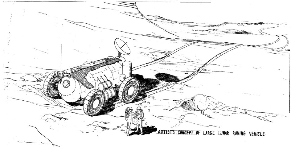
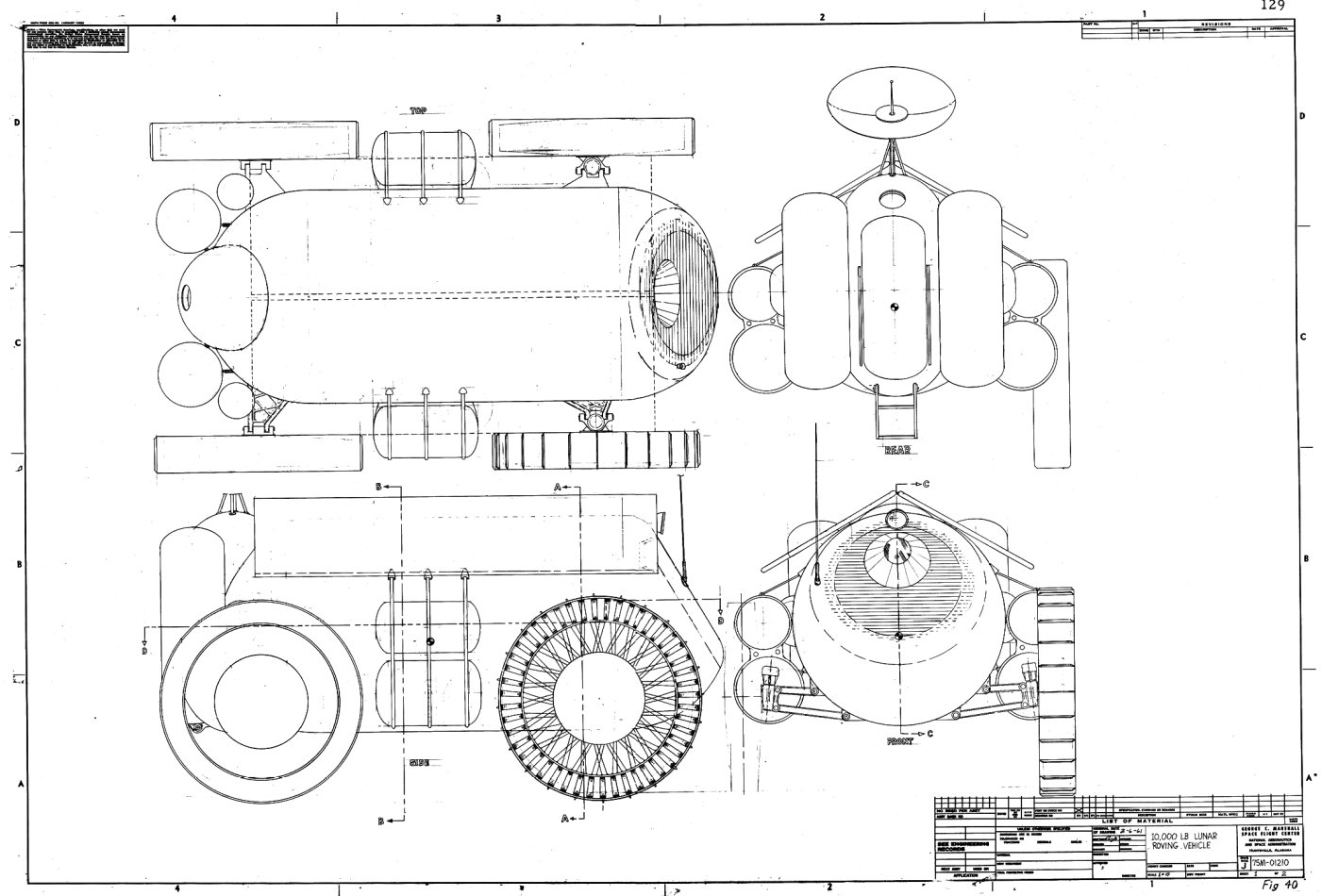
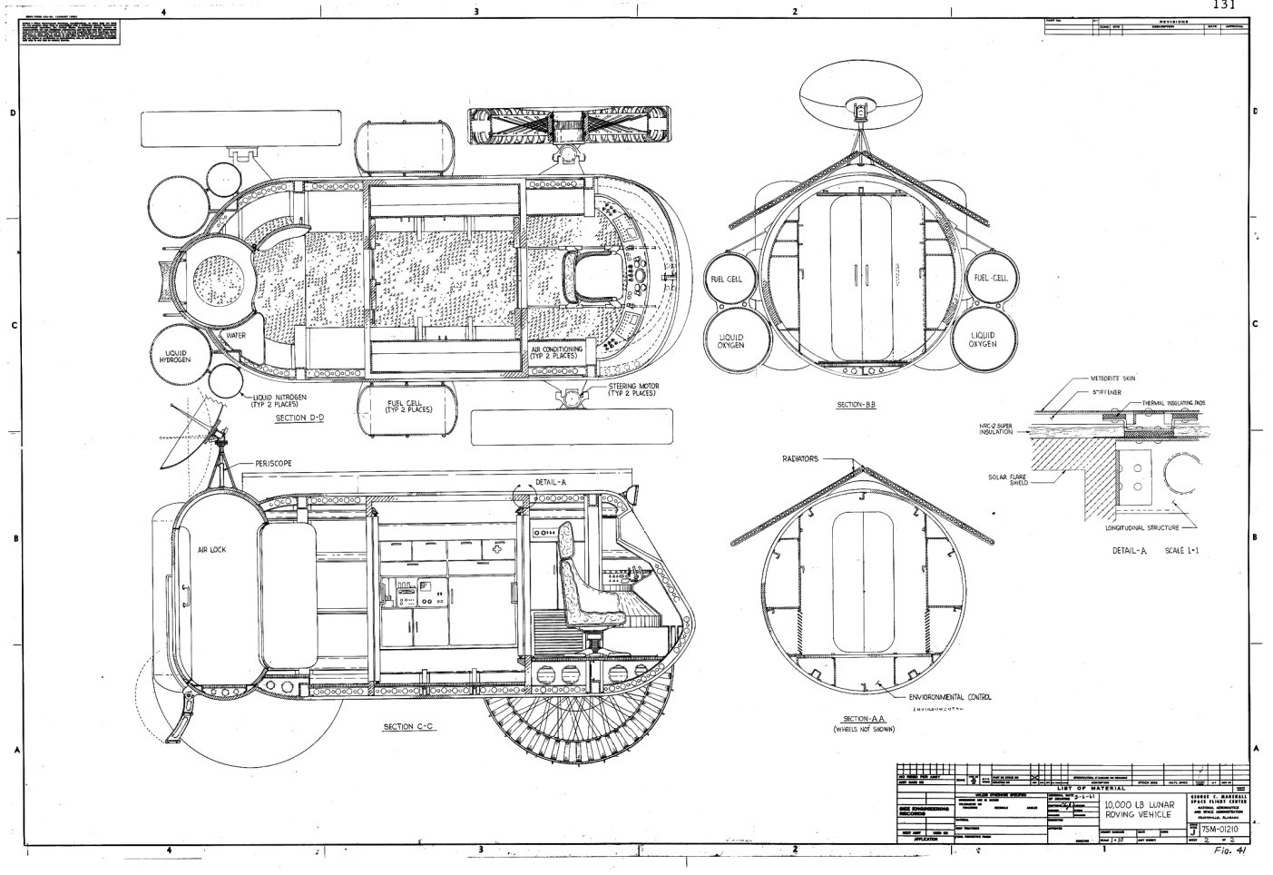
Much of 2001: A Space Odyssey‘s design work was claimed to have been influenced by actual design work being done by NASA and its contractors. The work pod, for example, sure looks a whole lot like this Boeing concept. One major difference between the Boeing and 2001 designs, though, is the unusual recessed window seen on the 2001 pod. I’d never seen anything quite like it… until I saw this 1961 NASA-Marshall Space Flight Center concpet for a large, 10,000-pound pressurized lunar rover. The front window is a dead ringer for the 2001 pod’s window. Additionally, it also bears a slight resemblance to the “moon bus,” especially the cutaway views. I would not be the least bit surprised if the 2001 designers were given drawings of this vehicle, perhaps these drawings, and took a few design elements.
The window would seem to provide a pretty awful view of the terrain ahead. Still, it’s kind of a neat design. Max speed, 9 mph, range about 280 miles and mission duration of 30 days with a crew of two.
13 Responses to “Open the pod bay garage door, HAL”
Sorry, the comment form is closed at this time.
The mind behind 2001’s visual design was a certain Mr. Ordway, who swam in this kind of studies. The one-man space pod is a classy copy of the CALAC design for the same concept; the Orion shuttle design comes from a Kraft Ehricke late 50s concept, the Discovery habitat pod (the sphere) comes from Boeing’s PARSECS concepts, und so weiter.
CL-620 to be precise.
The rover’s single window does offer a wide angle of view…and reminds me of those on deep submersibles. Presumably the design dates to a time larger vacuum-safe windows were thought infeasible?
That window also seems similar to the one on the soviet LK lunar lander.
Convergent evolution??……..
This is awesome! I have been looking for this kind of stuff for my “Lunar Winnebago” design.
It also occurs to me the inset window keeps the glass itself shadowed except for the angle of view itself. Perhaps prior to the thought of gold-plating visors, solar glare was thought a danger?
I noticed the LK resemblance also; it could be that’s because both are designed to resist air pressure – a concave shape would work better than a flat plate in that regard, the same way that a lot of high pressure gas tanks have a concave bottom on them.
> a lot of high pressure gas tanks have a concave bottom on them.
I thought it didn’t matter whether the tank end was concave or convex, as long as it was curved, to follow (I think) Pascal’s principle. The only reason they use a concave bottom, is so the tank stands up better…
Indeed, look at the tanks in the drawings above, *both* ends are convex.
It would depend on if you want to put the stress on the overall surface or on the edges where the concave surface meets the pressurized one.
In a concave surface the pressure will try to make the domed-in surface spread out into a flat disc, and a strong rim is needed to keep it from doing that.
For comparison, here’s a cutaway of the Soviet LK Moon lander, showing how the concave front let the standing cosmonaut look down through a window at the Moon’s surface during landing: http://www.astronautix.com/graphics/l/lkkaluga.jpg
Trying to get the same view through a spherical front on the module would have meant a larger window mounted a lot lower down and quite far away from the cosmonaut’s face.
Hello,
I know this is an old post, but you may be able to help.
We’re a group of University students who’ve been tasked with a model making assignment, and reverse image searching we found the diagrams we’ve been given on this website:
http://pics-about-space.com/moon-rover-blueprint?p=2#img5673496193409917793
That website lists this blog post as a their source, but the images here are all broken.
Are you able to provide us with the images you had here, if they contain any more information for us to use it would be invaluable.
Thank you
The blog suffered an issue back in 2015 that resulted in internal HTML links getting corrupted. I’ve corrected them here.
Wow, thank you for fixing that.
I was afraid with the post being so old you may not be able to help, but those extra images are amazing. All we had to go on was the cross section, but the other two images answer so many questions!
The images were still there, it was the links that got corrupted. Don’t ask me how, tech support sure as hell couldn’t explain it, but when the blog went “funny” in August of 2015, all links to up-ship.com got a spurious “/blog” term added. With seven or so years worth of posts, I just couldn’t be bothered to go through every single post and correct all the links manually. So if you see another post with screwed up links, just remember that it’s easy to fix the problem. If you click on it and the address includes “blog/blog/” just remove one of those “blog/” terms and you’ll be fixed right up.