This is a relatively commonly reproduced drawing:
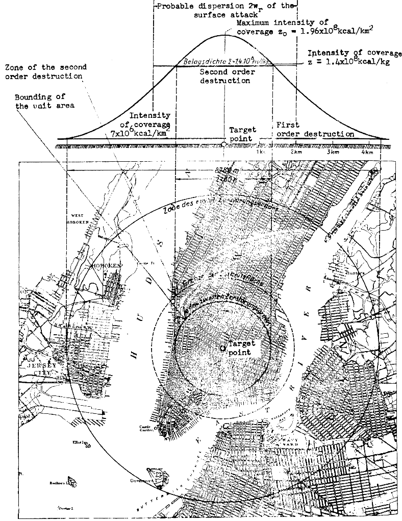
It comes from the English-language translation of Eugen Sangers report “A Rocket Drive for long Range Bombers,” which described a wartime German project to develop a global-range hypersonic rocket bomber. The graphic above is sometimes used to show that the Germans were working an atomic bomb… how else to explain the vast level of damage represented?
Well, the damage does *not* come from a single bomb, conventional, nuclear or otherwise. It comes from a *lot* of high altitude conventional bombs. The “bell curve” graph shows the effect of a statistically large number of bombs being dropped on Manhattan, all aimed at the same point and a normal distribution “miss pattern” being introduced. What Sanger’s showing is the sort of damage/square meter that New York could experience if it was plastered with dozens or hundreds of bombs, not one single device.
As with light, sound and gravity, a bomb going off produces, to first order, an inverse square law damage graph. This means that the further away you get, the softer the effects… and it means that the *closer* you get, the damage becomes exponentially greater. In theory, the graph, even for something like a firecracker, would go to an infinite spike at zero radius. Something like this:
What stops that from being true is that bombs are of finite size; the graph begins to break down roughly at the surface of the bomb. So it’s a spike until you get in to the radius of the actual bomb (a meter or two for a truly badass bomb), and then it goes fuzzy. But the Sanger graph shows not a spike, but a bell. The “exponential spike” as you get closer to ground zero seems to crap out at about a radius of one *kilometer.*
Each Sanger bomb could in principle wipe out a few city blocks, perhaps take out a skyscraper or two. But as we saw on Islam Outreach Day in 2001, it doesn’t take a nuke to create that sort of damage. A nuke, even a small one, does *vastly* more damage.
The Silverbird, like the A-9/A-10, would have been a spectacularly ineffective weapons system without atomic warheads. The reason why these projects got the official support that they did is because as weapons of *terror* they could well have been quite effective.
Why is this graph shown occasionally to represent a nuke when a few seconds reflection shows that the idea is silly (and a glance at the actual source documentation utter rejects the idea)? Well, on one hand, there’s sheer laziness. Once someone gets it in their head that the Nazis were close to having nukes, anything they see that says “The Nazis were close to having nukes” automatically looks reasonable. On the other hand, there are motives less pure than laziness: the desire of many to suggest that the Nazis were much more advanced than they really were. Oddly, this drive seems to exist on both sides of the Nazi/anti-Nazi debate: the pro-Nazi tards want to believe that the Nazis really were some race of supermen, because it makes them think that *they* are supermen too. And some anti-Nazis – in particular, a lot of eastern European authors and the like – also seem to see the Nazis as supermen. How else to explain how a relatively small nation could rise so quickly from economic disaster to nearly dominate and exterminate the rest of Europe? Both views are, of course, wrong. The Nazis were just people – albeit people who accepted an evil and crazy economic and social philosophy. And they were people who were nowhere near having nukes.
And there’s a third motive… profit. It makes a better story if the Sanger “Silverbird” was to drop a nuclear device on New York City than if it was just going to drop a three-ton conventional bomb. All the better to sell “documentaries” and books.
3 Responses to “The most abused diagram in aerospace history”
Sorry, the comment form is closed at this time.
I was lucky enough to get my hands on one of the original numbered copies of the US translation of Sanger’s report via intra-library loan from the Wright-Paterson AFB library.
What you haven’t pointed out is the pecular egg-shaped blast damage areas from the Antipodal Bomber’s bombs hitting the ground while still going at multi-Mach speeds forwards versus the shockwaves formed by the detonation of the explosives in them that accelerate at hypersonic speeds forward from the detonation point.
Diagrams of that are shown in the report.
Anyone want the entire report, I’ve got it as a PDF, and will send it to you as a ZIP file.
> Anyone want the entire report, I’ve got it as a PDF, and will send it to you as a ZIP file.
Much as I would have loved to scan in my own copy (which was photocopied *probably* from the same copy you saw) and and sell is as one of my Up-Ship documents… sadly, it is available free for the downloading on several websites, such as this one:
http://www.astronautix.com/data/saenger.pdf
“Much as I would have loved to scan in my own copy (which was photocopied *probably* from the same copy you saw)”
That main rocket engine is really something, isn’t it?
It’s really impressive to make a rocket engine that’s over 100% efficient, like Sanger claimed it would be. 😉